
Case study

ByJo
Personal finance, beautifully simple.
A personal finance app built with clarity and care — intuitive budgeting, spending insights, savings goals, and home screen widgets. Designed for the App Store with Apple's Human Interface Guidelines at its core.
The challenge
Finance apps overwhelm. People need clarity.
Most budgeting apps dump charts, categories, and bank connections on day one. Users who just want to understand where their money goes end up abandoning the app before they build a habit.
ByJo started from a different premise: show the essentials first, make every screen scannable in seconds, and respect privacy by keeping sensitive data on-device wherever possible.
The solution
Budgeting that feels calm, not clinical.
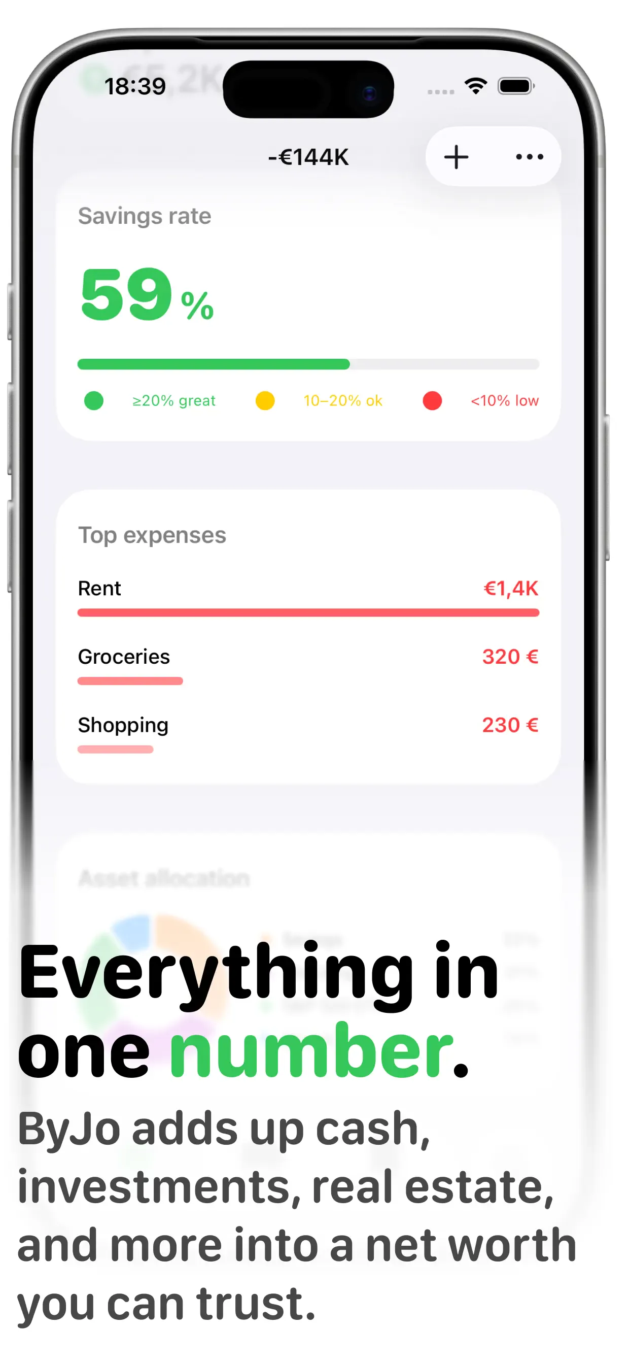
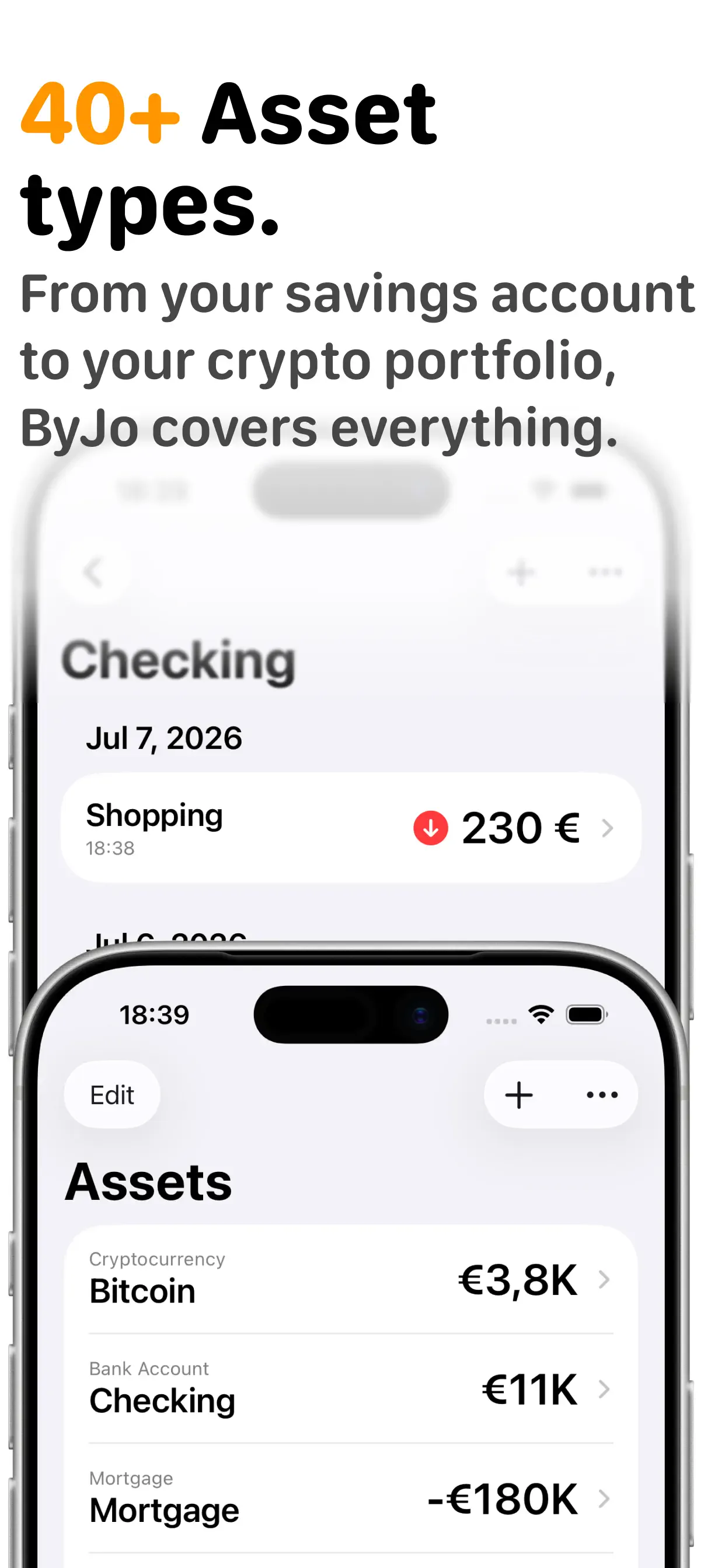
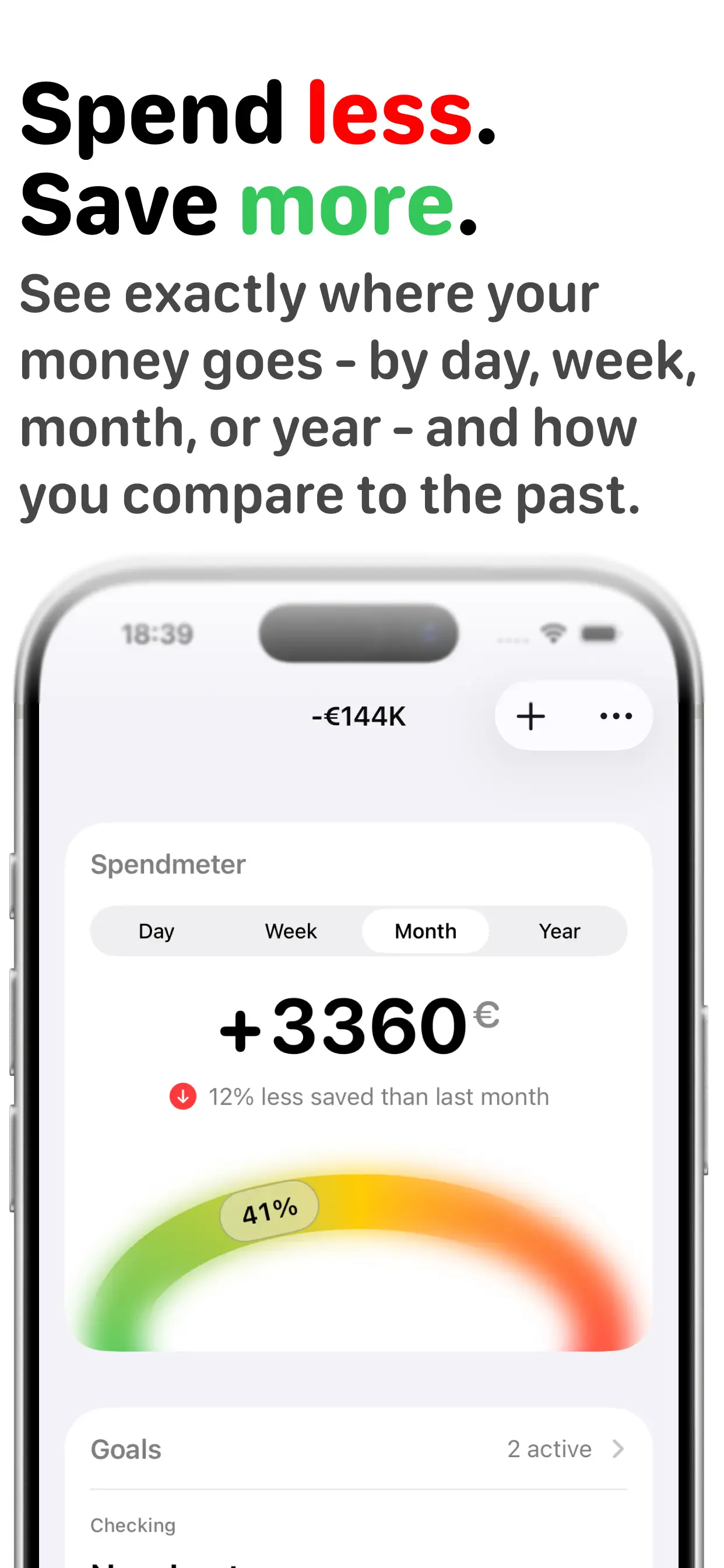
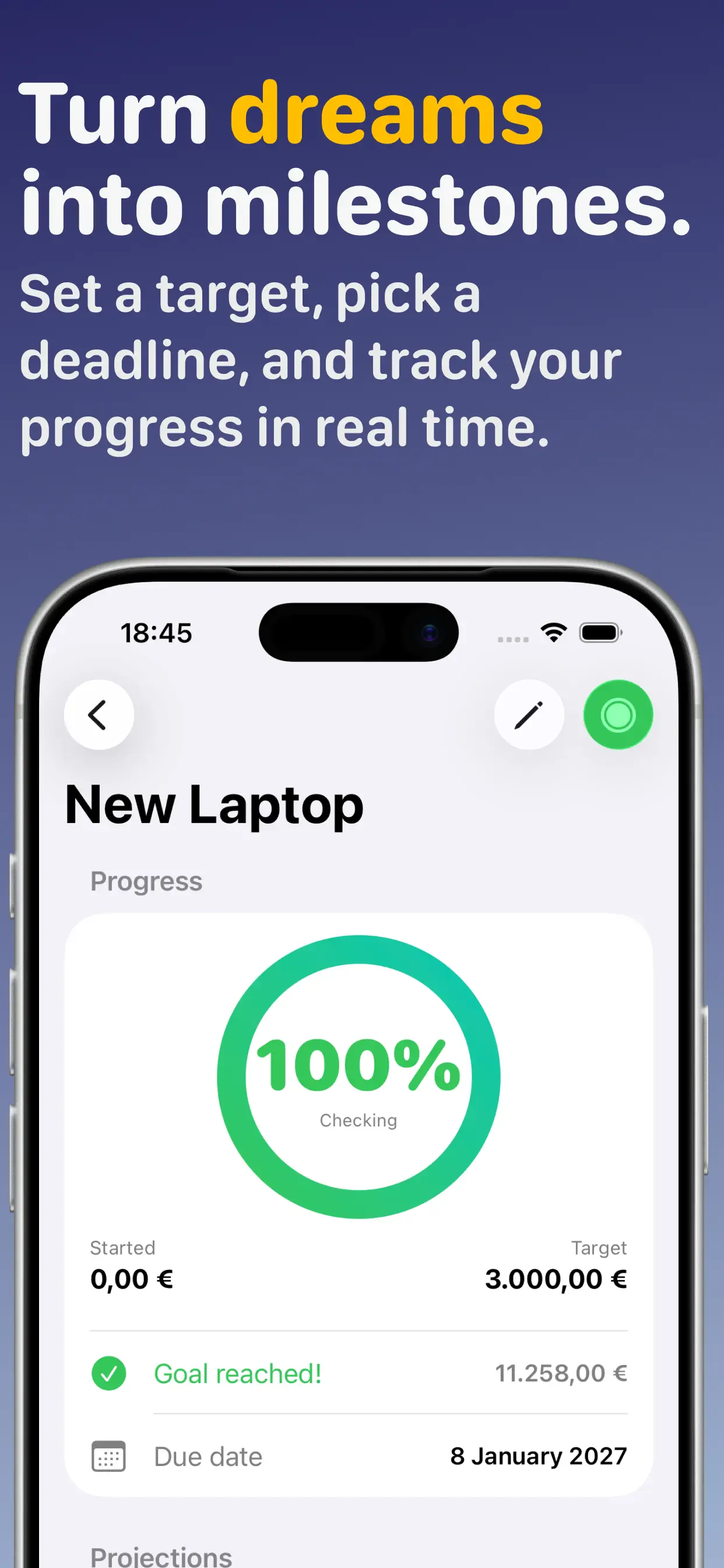
ByJo combines a spend meter, recurring transaction tracking, savings goals, and home screen widgets — all wrapped in an onboarding flow and UI polish that meets App Store standards out of the box.
- Intuitive budgeting with at-a-glance spending insights
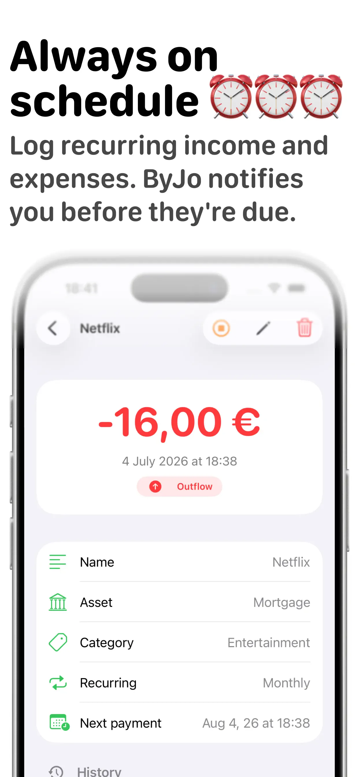
- Recurring transactions and savings goal tracking
- Home screen widgets for quick financial check-ins
- App Store–ready UI, onboarding, and accessibility
- Privacy-first, on-device design philosophy
Screenshots
App Store screenshots.
Outcome
App Store ready from the first release.
ByJo is live at by-jo.com. The app demonstrates how I approach client MVPs too — not just working features, but the onboarding, empty states, and visual polish that Apple reviewers and real users expect.
Finance is a trust category. ByJo earns it through restraint: fewer screens, clearer hierarchy, and widgets that put the number you care about on your home screen without opening the app.